We use cookies to imporve your experience. By using our site, you consent to our cookie policy Learn more
arrow arrow_up breadcrumb-chevron-right breadcrumb-home dropdown-arrow-down loader GALogoWUNEP GALogo2018 GALogo2019 menu read-more-plus rrss-email rrss-facebook rrss-flickr rrss-instagram rrss-linkedin rrss-twitter rrss-vimeo rrss-youtube rrss_google_plus rrss_skype rrss_web pdf search share Completed In Process Ideas In Develpment Toogle Toogle Thumbnail View List View play close filter-collapse filter edit media_photo_library media_video_library graphics pictures videos collections next

Population and Development in Africa

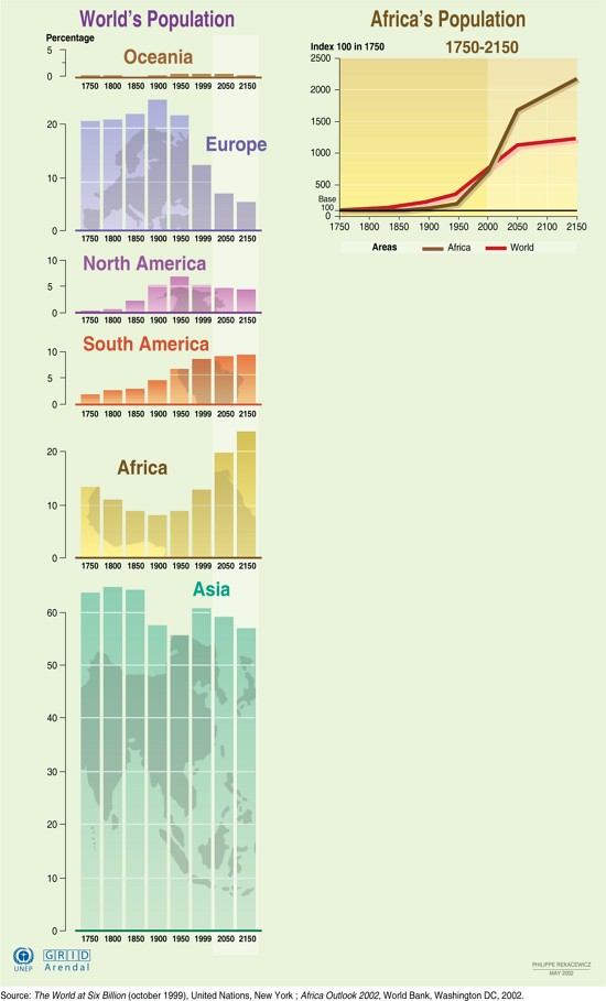
As population increases, so does the demand for natural resources. This graphic shows how the world's population distribution has changed since 1750 (in 50-year increments), with projections for 2050 and 2150. It also shows how Africa's population and the world's population have increased since 1750, with projected data to the year 2150. The figures are based on an index of 100 in the year 1750.

Year: 2005

From collection: Vital Climate Graphics Africa

Cartographer: Cartografare il Presente/Nieves Izquierdo

Graphics included in same album

View all media

Publications it appears in

View all publications