5.4.2. Nitrous Oxide
|

Figure 5-7: Standardized global
N2O emissions for SRES scenarios, classified into four scenario families
(each denoted by a different color code - A1, red; A2, brown; B1, green;
B2, blue). Marker scenarios are shown with thick lines without ticks,
globally harmonized scenarios with thin lines, and non-harmonized scenarios
with thin, dotted lines (see Table 4-3). Black lines show percentiles,
means, and medians for SRES scenarios. For numbers on the two additional
illustrative scenarios A1FI and A1T see Appendix VII.
|
|

Figure 5-8a: Standardized global N2O emissions
in the A1 family scenarios. The marker scenario is shown with a thick
line without ticks, the globally harmonized scenarios with thin lines,
and the non-harmonized scenarios with thin, dotted lines (see Table 4-3). In the SPM, A1C and A1G scenarios are merged into one fossil-intensive
A1FI scenario group (see also footnote
2).
|
|

Figure 5-8b: Standardized global N2O emissions
in the A2 family scenarios. The marker scenario is shown with a thick
line without ticks, the globally harmonized scenarios with thin lines,
and the non-harmonized scenarios with thin, dotted lines (see Table 4-3).
|
|
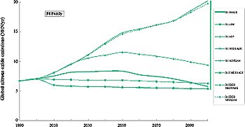
Figure 5-8c: Standardized global N2O emissions
in the B1 family scenarios. The marker scenario is shown with a thick
line without ticks, the globally harmonized scenarios with thin lines,
and the non-harmonized scenarios with thin, dotted lines (see Table 4-3).
|
|
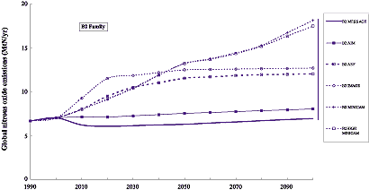
Figure 5-8d: Standardized global N2O emissions
in the B2 family scenarios. The marker scenario is shown with a thick
line without ticks, the globally harmonized scenarios with thin lines,
and the non-harmonized scenarios with thin, dotted lines (see Table 4-3).
|
Uncertainties in the estimates of current N2O emissions (Table
5-3) are also reflected in base-year 1990 differences, between 4.8 and 6.9
MtN across the six models used to develop the SRES scenarios. The range across
the four markers (Table 5-3) is not as wide, between
6.0 and 6.9 MtN, and leans more toward the higher end of the uncertainty range
reported in Houghton et al. (1995). After standardization, 1990 N2O emissions
in the SRES scenarios were set to 6.7 MtN, well within the IPCC WGI SAR range
(Table 5-3). Even more so than for CH4 , food supply
is assumed to be a key determinant of future N2O emissions. Size, age structure,
and regional spread of the global population are likely to affect future emission
trajectories, together with diets and rates of improvement in agricultural productivity.
The representation of how these driving forces translate into N2O emissions
varies across the models because of differences in both sectoral coverage and
emission factors. As a result, differences in emission trajectories are not
only scenario dependent, but also model dependent, which illustrates additional
uncertainties in our understanding and representation of driving forces and
their influence on N2O emissions.
The range of emissions across all 40 SRES scenarios increases continuously
over the 21st century (Figure 5-7). By 2100, N2O emissions range between 5
and 20 MtN. Emission ranges also tend to be comparable across the four scenario
storylines, an indication of the decisive impact of uncertainty in the modeling
(mentioned above). Future N2O emissions in the SRES scenarios tend to cluster
into two broad groups - those that project relatively flat, even slightly declining,
emissions and those that indicate continuously rising trends toward high emission
levels. Some other scenarios (e.g. A1B-ASF, B1-ASF, and B1-IMAGE) indicate the
possibility of transitional emission patterns in which N2O emissions peak around
2050 and decline thereafter, more or less in step with the population size.
As a result of differences in modeling approaches, no individual scenario tracks
the mean or median across all 40 scenarios of the SRES set.
5.4.2.1. A1 Scenario Family
The A1 family of scenarios covers close to the full range of N2O emissions
from the SRES scenarios (Figure 5-7). The A1G-MiniCAM scenario is at the high
end of the A1 range (Figure 5-8a). Most of the emissions increase in this scenario
is associated with the agriculture sector, primarily with animal manure management.
Emissions are driven by a rapid increase in income that induces steep increases
in meat and dairy consumption. The A1B-AIM marker scenario has emissions near
the low end of the range. This scenario assumes that fertilizer use in developing
countries is nearly saturated and that increased productivity comes from better
management. A portion of nitrogen from fertilizers is also assumed to be stored
indefinitely in underground water. However, the emissions from energy use in
A1B-AIM increase until the third quarter of the 21st century, and reach a level
about three times the 1990 volume. In the middle of the A1 family range lie
emissions from the A1B-ASF and A1B-IMAGE scenarios (Figure 5-8a). In these scenarios,
emissions growth to the 2050s is driven by growth in the agricultural and transportation
sectors. Thereafter, emissions decline, primarily because of declining population
levels and increases in agricultural productivity (lower production factor input
per unit of output).
As suggested by Figure 5-8a, differences in the energy
supply system reflected by the four A1 scenario groups (A1G, A1C, A1T, and A1
or "balance") are only partially translated into differences in N2O
emissions. For example, scenarios that rely on coal as the primary energy source
span the range from 6 MtN (A1C-MESSAGE) to 16 MtN (A1C-MiniCAM). At the same
time, trajectories of A1T "technology" scenarios are located in the lower end
of the emissions range.
5.4.2.2. A2 Scenario Family
N2O emission trajectories of the A2 scenario family fall into two major groups.
The first group includes the A2-AIM and A2-MESSAGE scenarios, and the rest of
scenarios form the second group. The A2-AIM N2O emissions increase at a relatively
low rate and do not exceed 10 MtN in 2100 (Figure 5-8b), because of a relatively
slow increase in nitrogen fertilizer input and omission of N2O sources associated
with animal wastes. N2O emissions in the second group of scenarios (which includes
the family marker A2-ASF) grow steadily throughout the 21st century, driven
by an increased demand for food and associated increases in the animal waste
and nitrogen fertilizer use (Table 5-6). In 2100 the emissions from this group
of scenarios range from 15 to 20 MtN.
5.4.2.3. B1 Scenario Family
The spread of N2O emissions in the B1 family is quite large. The high-end reflects
the agricultural assumptions used in the MiniCAM model, in which continued growth
in meat production is driven by increases in per capita consumption that more
than offset the reduction in population size (Figure 5-8c). The B1-AIM scenario
has emissions near the low end of the range, because fertilizer use in developing
countries is assumed to level off and better management increases productivity.
Emissions from animal waste, mobile sources, and other sources in B1-AIM are
nearly constant. The B1- IMAGE scenario (B1 family marker) has slowly increasing
emissions through to 2050, which predominately originate from increases in livestock
and the use of synthetic fertilizer (Table 5-6). After 2050, these emissions
decline as the population size and associated demand for animal products declines
(Figure 5-8c). The B1-ASF scenario has an intermediate emission trajectory with
a maximum of 11.5 MtN in 2050 and a subsequent decline to 9.3 MtN by 2100 (Figure 5-8c). The two illustrative scenarios A1G-MiniCAM and A1T-MESSAGE display similar
patterns of methane emissions as the A2 and B1 marker scenarios, respectively,
and are therefore not discussed separately here.
5.4.2.4. B2 Scenario Family
The B2 family of scenarios covers a large range of N2O emissions, similar to
that found for the A1 family (see Figure 5-7). In the B2-MESSAGE scenario (B2
family marker), which has the lowest emissions in the family, improvements in
agricultural productivity exceed increases in the demand for agricultural products
and significantly slow emission growth in the sector (Table 5-6). Slow growth
in agriculture and energy-related emissions and declines of emissions from other
sectors result in a relatively flat emissions profile (Figure 5-8d). Emissions
in the B2-ASF scenario are between the middle of the family range and its high
end. The continuous increase in emissions in the B2-ASF scenario (which lie
between the middle and high end of the family range) occurs through growth in
nitrogen fertilizer use, in animal wastes, and in mobile sources. It is driven
by increases in population and, to a smaller extent, by per capita increases
in consumption of meat and dairy products.
5.4.2.5. Inter-Family Comparison
The allocation of N2O emissions into source categories for the SRES marker
scenarios is shown in Table 5-6. Separate emissions estimates for fertilized
soils and manure were not available for all scenarios. As the emissions in Table
5-6 have not been standardized (see Box 5-1), base-year
1990 (and 2000) emissions are not the same for the different scenarios. In general,
base-year emissions are likely to have greater differences at finer levels of
detail. These differences result from different model calibrations, different
model methodologies, and different classification schemes.
| Table 5-6: N2O emissions (MtN) by source for the marker
scenarios (A1B-AIM, A2-ASF, B1-IMAGE, and B2-MESSAGE). Categories are fertilized
soils and manure, fossil fuel use and industrial processes (adipic and nitric
acid production), and other emissions. The "other" category includes biomass
burning, land-use change, and sewage treatment (in some models). Emissions
are provided in a non-standardized or "raw" format and are not comparable
with standardized emission estimates used in the figures and other tables. |
|
| |
|
1990
|
2000
|
2010
|
2020
|
2030
|
2040
|
2050
|
2060
|
2070
|
2080
|
2090
|
2100
|
|
| Fertilized Soils |
|
|
|
|
|
|
|
|
|
|
|
|
|
| + Manure |
A1B
A2
B1
B2
|
4.41
4.83
4.70
4.15
|
4.32
6.20
5.10
5.03
|
4.30
7.19
5.60
4.45
|
4.29
8.44
6.10
4.54
|
4.28
9.33
6.30
4.63
|
4.26
10.20
6.30
4.70
|
4.23
10.48
6.10
4.78
|
4.20
11.37
5.90
4.86
|
4.17
12.26
5.60
4.95
|
4.15
13.04
5.20
5.03
|
4.15
13.61
4.90
5.12
|
4.14
14.39
4.50
5.21
|
| Industry |
|
|
|
|
|
|
|
|
|
|
|
|
|
| + Fossil Fuels |
A1B
A2
B1
B2
|
1.22
0.99
0.90
0.95
|
1.29
0.73
0.90
0.94
|
1.46
0.70
1.00
0.90
|
1.80
0.85
1.20
0.85
|
2.05
0.95
1.30
0.90
|
2.13
1.02
1.30
0.90
|
2.21
1.04
1.40
0.89
|
2.11
1.07
1.30
0.94
|
2.02
1.10
1.20
0.98
|
1.95
1.13
1.10
1.03
|
1.92
1.19
1.00
1.06
|
1.89
1.22
0.90
1.08
|
| Other |
|
|
|
|
|
|
|
|
|
|
|
|
|
| |
A1B
A2
B1
B2
|
1.32
0.75
0.40
1.21
|
0.64
0.86
0.60
0.68
|
0.52
0.95
0.70
0.48
|
0.33
1.42
0.50
0.30
|
0.26
1.16
0.50
0.24
|
0.24
1.22
0.50
0.25
|
0.23
1.24
0.40
0.26
|
0.23
1.28
0.40
0.26
|
0.24
1.33
0.30
0.26
|
0.25
1.42
0.30
0.27
|
0.25
1.60
0.30
0.27
|
0.25
1.69
0.30
0.28
|
| Total |
|
|
|
|
|
|
|
|
|
|
|
|
|
| |
A1B
A2
B1
B2
|
6.95
6.57
6.00
6.31
|
6.25
7.79
6.60
6.65
|
6.28
8.84
7.30
5.83
|
6.42
10.71
7.80
5.69
|
6.59
11.44
8.10
5.77
|
6.63
12.44
8.10
5.85
|
6.67
12.76
7.90
5.93
|
6.54
13.72
7.60
6.06
|
6.43
14.69
7.10
6.19
|
6.35
15.59
6.60
6.33
|
6.32
16.40
6.20
6.45
|
6.28
17.30
5.70
6.57
|
|
Emissions from fertilized soils and manure from agricultural animals dominate
N2O emissions in all the SRES markers. The fraction of total emissions from
these two sources increases to about 80% in the A2, B1, and B2 marker scenarios,
while the agricultural fraction remains roughly the same over the 21st century
in the A1B marker. As discussed in Section 5.4.2, the range of future emissions
is similar across each scenario family when all storyline interpretations are
considered. Therefore, while it is useful to discuss emissions from the marker
scenarios individually, clearly differences in modeling approaches and model
assumptions have a particularly strong effect on future N2O emissions.
Agricultural emissions in the A1B-AIM marker scenario decrease over the 21st century, with increased productivity offsetting additional food demand. Agricultural
emissions in the A2-ASF marker scenario increase substantially because of the
food demands of a large population, coupled with less technological change.
Emissions in the B1-IMAGE marker scenario increase and subsequently fall. In
the B2-MESSAGE marker, agricultural emissions of N2O increase steadily throughout
most of the 21st century, with a decrease between 2000 and 2010. These patterns
differ because of the different driving forces (population and demand), model
assumptions, and modeling approaches.
Emissions from the categories "Industry/Fossil Fuels" and "Other" show a monotonic
rise in the A2-ASF marker, while emissions in the B1-IMAGE marker rise and subsequently
fall. Industry and fossil fuel emissions fall and then increase slightly in
the B2-MESSAGE marker scenario, while "Other" emissions, which largely arise
from land-use changes, fall. Industry and fossil fuel emissions in the A1B-AIM
marker scenario increase through the 21st century, but are countered by a decrease
in emissions from the "Other" category.
The combined dynamics of N2O emissions in the A1, B1, and B2 markers leads
to nearly stable or declining emissions during most of the 21st century (Figure
5-7). The B2 marker shows the lowest emission level (from the year 2010 to 2080),
despite a larger population than in A1 and B1. One possible reason is inter-model
differences in treatment of land-use changes. Unlike the other markers, the
A2-ASF scenario yields a continuous growth in emissions, which corresponds to
its assumptions of high population and slow technological change.