2.4.11. Carbon Intensity and Decarbonization

Figure 2-11: Global decarbonization
of primary energy - historical development and future scenarios, shown
as an index (1990 = 1). The median (50th), 5th, 25th, 75th and 95th
percentiles of the frequency distribution are shown. Statistics associated
with scenarios from the literature do not imply probability of occurrence.
Data source: Nakicenovic, 1996; Morita and Lee, 1998.
|
Decarbonization denotes the declining average carbon intensity of primary energy
over time (see Kanoh, 1992). Although the decarbonization of the world's energy
system shown in Figure 2-11 is comparatively slow, at
the rate of 0.3% per year, the trend has persisted throughout the past two centuries
(Nakicenovic, 1996). The overall tendency toward lower carbon intensities
results from the continuous replacement of fuels with high carbon content by
those with low carbon content.
The carbon intensities of the scenarios are shown in Figure
2-11 as an index spliced in the base year 1990 to the historical development.
The median of all the scenarios indicates a continuation of the historical trend,
with a decarbonization rate of about 0.4% per year, which is similar to the
trend in the IS92a scenario (Pepper et al., 1992).
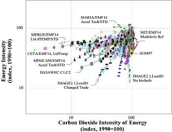
Figure 2-12: Global decarbonization
and deintensification of energy in the scenarios, 1990 to 2100; energy and
carbon intensities shown as an index (1990 = 1). Some of the scenarios are
identified in the figure. Data source: Morita and Lee, 1998.
|
The scenarios that are most intensive in the use of fossil fuels lead to practically
no reduction in carbon intensity. The highest rates of decarbonization (up to
3.3% per year) are from scenarios that envision a complete transition to non-fossil
sources of energy.
Figure 2-12 illustrates the relationships between energy
intensities of gross world product and carbon intensities of energy across the
scenarios in the database. Both intensities are shown on logarithmic scales.
The starting point is the base year 1990 normalized to an index (1990 = 100)
for both intensities. Scenarios that unfold horizontally are pure decarbonization
cases with little structural change in the economy; scenarios that unfold vertically
indicate reduction in the energy intensity of economic activities with little
change in the energy system. Most scenarios stay away from these extremes and
develop a fan-shaped pattern - marked by both decarbonization and declining
energy intensity - across the graph in Figure 2-12.
The fan-shaped graph illustrates the notable differences in policies and structures
of the global energy system among the scenarios. For example, in a number of
scenarios decarbonization is achieved largely through energy efficiency improvements,
while in others it is mainly the result of lower carbon intensity because of
the vigorous substitution of fuels. A few scenarios follow a path opposite to
the other scenarios: decarbonization of primary energy with decreasing energy
efficiency until 2040. After 2040 the ratio of CO2 per unit of primary energy
increases - in other words, recarbonization.
2.4.12. Comparison of Indicators
Figure 2-13 illustrates the database distributions of
CO2 , population, gross world product, primary energy, and carbon intensity
of energy. The circles closest to the center denote the minimum value of the
distribution; the solid circles denote the median value; and the shaded circles
represent the maximum database value for each variable. While the values are
connected in the form of a snowflake, it is important to note that those of
a given range (e.g., minimum, median, and maximum), taken together, do not necessarily
yield a consistent or logically possible scenario. As is shown in Chapter
4 (Figure 4-4), actual scenarios may fall into a median
range on some axes and into a higher or lower range on others. Snowflake diagrams
are useful because they allow the reader to see at a glance the full range of
values encompassed by the database. Subsequent snowflake diagrams plot SRES
scenario values on the various axes to illustrate where the scenarios fall relative
to the database minimum, median, and maximum values. Snowflake diagrams should
be used only for purposes of scenario classification and interpretation and
not for scenario design, since the latter could lead to logical inconsistencies.

Figure 2-13: Global emissions
scenarios in the database and their main driving forces. The minimum,
maximum and median (50th percentile) values for 2100 are shown on seven
axes of the heptagon based on the scenarios in the database. The seven
axes show the ranges across the scenarios in 2100 of CO2 emissions in
GtC, population in billions, gross world product in trillion US dollars
at 1990 prices, gross world product growth rates in percent per year,
energy intensity in MJ per US dollar at 1990 prices, primary energy
in ZJ (1000 EJ) and carbon intensity in tC per TJ.
|