We use cookies to imporve your experience. By using our site, you consent to our cookie policy Learn more
arrow arrow_up breadcrumb-chevron-right breadcrumb-home dropdown-arrow-down loader GALogoWUNEP GALogo2018 GALogo2019 menu read-more-plus rrss-email rrss-facebook rrss-flickr rrss-instagram rrss-linkedin rrss-twitter rrss-vimeo rrss-youtube rrss_google_plus rrss_skype rrss_web pdf search share Completed In Process Ideas In Develpment Toogle Toogle Thumbnail View List View play close filter-collapse filter edit media_photo_library media_video_library graphics pictures videos collections next

Arctic surface air-temperature change

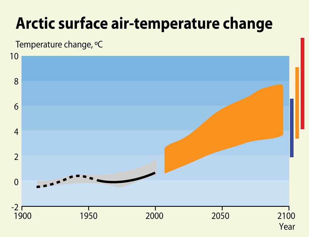
Change is measured relative to measurements from 1901 to 1950 (black curve). Orange region is the 2001-2100 prediction given the A1B scenario (pCO2 increase to 700 ppm by 2100). Bars to the right indicate the predictions for 2091–2100 for the scenarios B1 (blue bar, pCO2 increases to 500 ppm by 2100), A1B (orange bar, pCO2 increases to 700 ppm by 2100), and A2 (red bar, pCO2 increases to 800–1 000 ppm by 2100).

Year: 2009

From collection: Frozen Heat - A Global Outlook on Methane Gas Hydrates

Cartographer: GRID-Arendal

Graphics included in same album

View all media